I love Instagram and creating visual content. I’ve learned how important Instagram highlight covers are. They make our profiles look great and show our brand’s style and colors. By choosing the right designs, we can make our profiles more engaging and market our products.
Key Takeaways
- Instagram highlight covers allow users to save Stories under specific categories for permanent display on their profiles.
- Consistency in color, theme, or pattern is recommended for maintaining a cohesive look across highlight covers.
- Using branded color palettes in highlight covers helps reinforce brand identity.
- Showcasing products through highlight covers serves as a marketing tactic for businesses on Instagram.
- Canva is a popular platform for creating Instagram highlight covers with customizable templates and design tools.
Understanding Instagram Story Highlights
Instagram Story Highlights let users save their Stories forever on their profile. They act like a portfolio, showing off your brand’s work. Organizing them makes your profile look good and boosts engagement.
What Are Instagram Story Highlights?
Highlights are saved groups of stories on your profile. Unlike regular Stories, they don’t disappear. They let you share your best content and make a lasting impression.
Why Highlights Matter for Your Profile
Organizing Highlights is key for a good profile. They let you show off your best work, like products or services. This makes your profile more interesting and helps you connect with your audience.
Benefits of Organized Highlights
- Improved user experience: Organized Highlights make it easier for your audience to navigate your profile and find the content they’re interested in.
- Increased profile visits: Well-designed Highlights can attract new visitors to your profile and encourage them to explore your content further.
- Better brand representation: Consistently designed Highlight covers and organized content can help strengthen your brand identity and showcase your professionalism.
Instagram Story Highlights can boost your profile’s engagement. They let you show your brand’s true self and create a great experience for your audience.
The Instagram Stories Benchmark Report for 2023 shows that the fourth frame of the day has an 81% retention rate. This is key for understanding Stories engagement. Each Highlight can have up to 100 Stories, making it a great way to collect content.
“Hermès, a brand that takes a creative approach to Instagram Highlight covers, creates custom covers alluding to their artistry while incorporating recognizable brand elements like their signature orange and logo.”
The New York Times uses text-heavy covers for their Highlights. They balance text with emojis to represent each Highlight. The title on Highlights is cut off at nine characters, showing the need for short and impactful names.
Educational content on Instagram Stories can be saved in Highlights. This makes it easy for users to refer to and share your content long after it’s posted. A retention rate of 81% for the fourth frame shows how important engaging content is in Highlights.
The Power of Visual Branding on Instagram
As an Instagram user, I know how key a cohesive visual aesthetic is for my profile. A strong Instagram aesthetic makes your profile eye-catching. It also helps define your brand and increase recognition among followers. By using consistent brand colors, typography, and design, you create a unique visual presence.
Profile design is crucial for visual branding on Instagram. Your profile picture and feed layout should work together seamlessly. Using visual consistency in your posts, stories, and highlight covers strengthens your brand. It makes your content more memorable to your audience.
“Consistency is key when it comes to building a strong Instagram aesthetic. By maintaining a cohesive visual style, you can create a lasting impression and foster deeper connections with your followers.” – Social Media Strategist, Jane Doe
Using strategic brand colors and typography can also enhance your Instagram aesthetic. Choose a color palette that matches your brand’s identity. Use consistent fonts in your content to boost visual appeal and recognition.
The power of visual branding on Instagram is in creating a memorable presence. Focus on visual consistency and your brand’s unique aesthetic. This way, you can build a standout Instagram profile that connects deeply with your followers.
Essential Tools for Creating Instagram Highlight Covers
Making Instagram Highlight covers look great is key for a professional profile. There are many design tools and platforms to help you. Let’s explore some top picks for your Instagram Highlight covers.
Using Canva for Cover Design
Canva is a favorite for its easy-to-use design platform. It has lots of templates and tools for Instagram Highlight covers. You can change colors, add icons, and use your brand’s fonts and colors easily. Its drag-and-drop feature makes creating professional covers quick and simple.
Alternative Design Platforms
Canva isn’t the only choice for creating Highlight covers. Picmonkey, Visme, and Snappa also offer great options. They let you design covers with lots of customization. These tools might have special features that fit your needs better.
Mobile Apps for Cover Creation
For those always on the move, there are mobile apps for cover design. Canva, Unfold, and Adobe Spark are great for creating covers on your phone or tablet. They make it easy to design and update your covers anytime.
Choosing the right design tools is important for your brand’s look. They should help you make covers that are appealing, consistent, and show off your brand’s identity. With the right tools, you can make your Instagram stand out with great Highlight covers.
“Consistent branding on highlight covers can help users easily identify a business or brand.”
Popular Instagram Highlight Covers Themes
Creating a stunning Instagram aesthetic starts with your story highlight covers. You can choose from nude and beige tones to nature-inspired designs. Let’s explore some top Instagram highlight cover themes to boost your profile’s look.
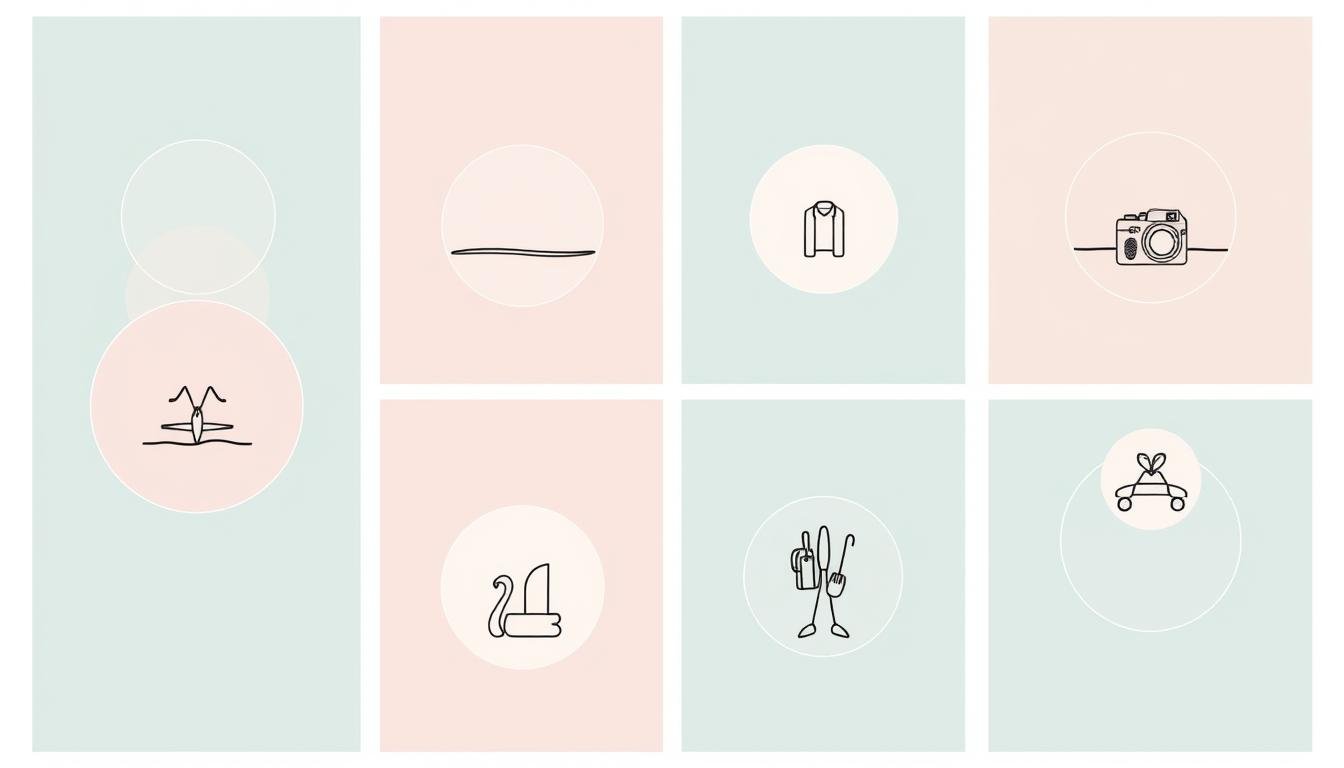
Minimalist, white-based covers are a big hit. They add elegance and let your content shine. Pastel palettes are also popular, offering a soft, feminine touch that fits many styles.
For a bold look, try vibrant colors like yellow or fun patterns like stripes and marble. These designs grab attention and make your profile pop. Nature lovers can go for covers with leafy greens, florals, or holographic effects, adding freshness and wonder.
It’s important to pick cover themes that match your brand and appeal to your audience. A cohesive Instagram aesthetic not only makes your profile look better but also connects you more with your followers.
| Highlight Cover Theme | Description | Example |
|---|---|---|
| Nude/Beige | Soft, minimalist tones that exude a refined, sophisticated look. | |
| Nature-Inspired | Designs featuring elements like leaves, florals, or holographic effects that evoke a fresh, organic vibe. | |
| Blank | Simple, text-based covers that showcase a clean, minimalist aesthetic. | |
| Watercolor | Soft, fluid brushstrokes that lend a whimsical, artistic touch to your highlights. | |
| Pink Floral | Feminine, romantic designs featuring delicate floral patterns in shades of pink. |
These are just a few examples of the many highlight cover themes out there. They help you create a stunning Instagram aesthetic and inspire your design inspiration for cover styles. Be creative and let your personality shine through your Instagram Highlight covers.
Step-by-Step Guide to Designing Custom Covers
Making custom highlight covers for your Instagram can really boost your brand’s look. It doesn’t matter if you run a small business, are an influencer, or work in the creative field. Knowing how to design covers is crucial to grab your audience’s attention.
Choosing the Right Size and Format
The best size for an Instagram highlight cover is 110 x 110 pixels. This size makes your cover look clean and round on your profile. Even though Instagram shows these covers as 1:1, design them at 1080 x 1920 pixels for a 9:16 aspect ratio. This makes sure your covers look great on all devices.
Selecting Icons and Typography
Pick icons and fonts that show off your brand’s personality. Look at your logo and brand guidelines to keep your Instagram consistent. Go for simple icons and fonts that are easy to read and match well together.
Color Scheme Selection
Choosing the right colors is key for eye-catching custom highlight covers. Use your brand’s main and secondary colors, or try out colors that go well with them. Don’t use too many colors. A simple palette keeps your look professional and polished.
By following these design process steps, you’ll make custom cover creation tutorial that boost your Instagram. With some creativity and focus on details, your highlight covers will be a big part of your online brand.
Trending Cover Design Styles
Instagram’s visual appeal is key. Highlight covers at the top of your profile can draw in new followers. They also show off your brand’s style.
Current trends include minimalist, pastel, hand-drawn, geometric, and gradient designs. These styles fit many brand looks, making your profile modern and appealing.
A simple cover can look sleek and sophisticated. Soft pastel covers with illustrations feel whimsical. Geometric and gradient backgrounds add creativity and energy.
Choose a style that matches your brand’s identity. Using the latest trends can make your profile stand out. It helps connect with your audience in a meaningful way.
Popular Instagram Highlight Cover Design Styles
- Minimalist designs
- Pastel color schemes
- Hand-drawn illustrations
- Geometric patterns
- Gradient backgrounds
| Design Style | Description | Examples |
|---|---|---|
| Minimalist | Simple, clean designs with a focus on negative space and essential elements. | |
| Pastel | Soft, muted color palettes that create a calming, feminine aesthetic. | |
| Hand-drawn | Whimsical, artistic designs featuring hand-drawn illustrations and typography. |  |
| Geometric | Bold, eye-catching designs with geometric shapes and patterns. | |
| Gradient | Smooth, seamless color transitions that create a dynamic, modern look. |
By using these Instagram trends and cover design inspiration, you can enhance your profile. This will engage your audience in new ways.
Best Practices for Organizing Your Highlights
As an avid Instagram user, I’ve learned that organizing your profile’s highlights is key. With over a billion active users, making your content stand out is crucial. It helps attract potential customers or followers.
Strategic Highlight Categories
Create highlight categories that match your content and brand. Some good categories include:
- Product Showcase
- Customer Reviews
- Marketing Campaigns
- Employee Advocacy
- Non-Profit Initiatives
- Brand Collaborations
Content Organization Tips
Make sure your highlights are easy to navigate. Here are some tips:
- Use clear and concise titles for your highlight categories.
- Arrange your highlights in a logical order, with the most important or frequently updated content at the forefront.
- Regularly review and update your highlights to reflect your current offerings and content.
- Leverage the Link Sticker feature in your Instagram Stories to drive traffic to your website or specific pages.
Maintaining Visual Consistency
Consistency is key for your Instagram profile’s look. Use the same design elements, like colors, fonts, and icons, for all your highlight covers. This creates a cohesive and professional brand identity.
| Highlight Organization Metric | Percentage |
|---|---|
| Percentage of U.S. marketers using Instagram for social media marketing | 73.2% |
| Percentage of worldwide influencers using Instagram more for influencer marketing campaigns | 88.9% |
| Percentage of U.S. marketers using Facebook for social media marketing | 86.8% |
By organizing your highlights strategically, keeping visuals consistent, and updating content regularly, you can create a great Instagram profile. It showcases your brand’s best and connects with your audience.
Common Design Mistakes to Avoid
Making Instagram highlight covers is like art. It’s easy to make mistakes. I’ve seen many design errors, cover inconsistencies, branding mistakes, and aesthetic pitfalls. These can ruin your profile’s look. Let’s look at some common mistakes to avoid.
- Inconsistent Color Schemes: A bad color choice can mess up your Instagram’s look. Make sure your covers match your brand’s colors.
- Overcrowded Designs: Don’t put too much in one cover. Simple designs are better. They let your content stand out.
- Poor Image Quality: Bad images look unprofessional. Use clear, high-quality pictures for your covers.
- Misaligned Text: Bad text placement can make your covers look messy. Make sure your text is neat and balanced.
Your highlight covers show off your brand. Avoid these mistakes to impress your followers.
| Common Design Mistake | Potential Impact | Recommended Solution |
|---|---|---|
| Inconsistent Color Schemes | Disjointed and disorganized appearance | Ensure color palette aligns with overall Instagram aesthetic |
| Overcrowded Designs | Cluttered and overwhelming visuals | Opt for clean, minimalist designs that allow content to shine |
| Poor Image Quality | Unprofessional and sloppy appearance | Always use high-quality, crisp visuals |
| Misaligned Text | Cluttered and unappealing look | Ensure typography is properly aligned and balanced |
Avoid these design errors, cover inconsistencies, branding mistakes, and aesthetic pitfalls. This will help you make great Instagram highlight covers. They will make your online presence better.

Conclusion
Instagram highlight covers are key to boosting your Instagram game. They help show off your brand and connect with your audience. By using tools like Canva and CapCut Online, you can make your covers look professional.
Whether you run a small business or a big brand, your highlight covers matter. They can make your Instagram more visible and engaging. This can lead to more success on the platform.
Your highlight covers are a big part of your Instagram strategy. By following the best practices and avoiding common mistakes, you can make a stunning profile. This will attract more followers and help you reach your goals. So, let’s start making those highlight covers that will take your Instagram to the next level!
FAQ
What are Instagram highlight covers?
Instagram highlight covers are key for a unified look and feel. They boost your profile by saving stories for easy access. This makes your content more engaging and consistent with your brand.
Why are Instagram Story Highlights important?
Highlights on Instagram are saved stories on your profile. They keep your content fresh and engaging. A well-organized profile attracts more visitors and shows off your brand’s personality.
How important is visual branding on Instagram?
Visual branding is crucial for a consistent look on Instagram. It means using the same colors and designs everywhere. A strong visual brand makes your profile memorable and unique.
What tools can I use to create Instagram highlight covers?
Canva is a top choice for making highlight covers, with free templates and icons. Other tools and apps also offer customization options. You can change colors, add graphics, and use your brand’s fonts.
What are some popular Instagram highlight cover themes?
Popular themes include nude, nature, blank, and many more. These themes help create a cohesive look for your profile. You can pick one that fits your brand’s style.
How do I create custom highlight covers?
To make custom covers, start with Canva or similar tools. Choose a template, clear it, and add your design. Type the cover’s name and duplicate for more. Customize each one and download as PNGs. Then, upload and edit your highlights.
What are some trending cover design styles?
Current trends include minimalist, pastel, and geometric designs. These styles can enhance your profile’s look. They make your Instagram modern and appealing.
How should I organize my Instagram highlights?
Organize highlights by category to match your content. Use the same design elements for a unified look. Update your highlights regularly to keep them fresh and relevant.
What are common design mistakes to avoid?
Avoid inconsistent colors, too much clutter, and poor quality images. Also, don’t mix too many styles. Keep your covers in line with your Instagram’s overall look.


Leave a Reply